|
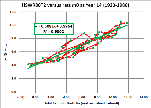
SWR Translator Graph with LinesHere is an HSWR80T2 versus return0 (real, annualized, total return) graph that includes a line from year to year. This shows how good and bad times cluster together. It also shows the effect of overlapping sequences on 30-year Historical Surviving Withdrawal Rates. 
|