Balanced Fund Comparison Graphs
Here is a comparison of the Year 10 NOMINAL returns of a Balanced Fund and the S&P500 index.
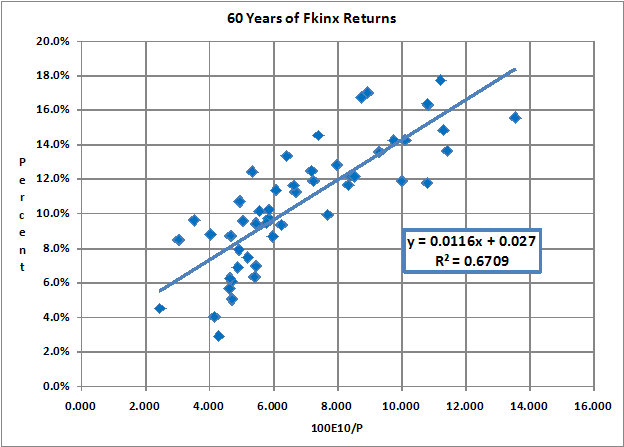
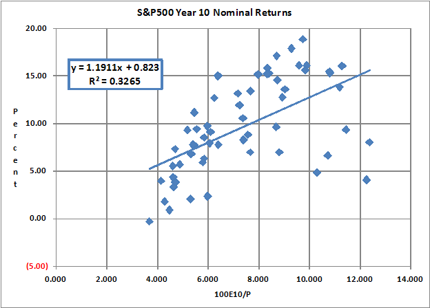
I got the list of FKINX returns from the Morningstar Income and Dividend Investing discussion board. It includes nominal returns from 1949 through 2009. I used Professor Robert Shiller’s S&P500 nominal data. I selected start years of 1923 through 1980.
The balanced fund shows a greater return at less volatility than the S&P500 index.
Have fun.
John Walter Russell
June 4, 2009
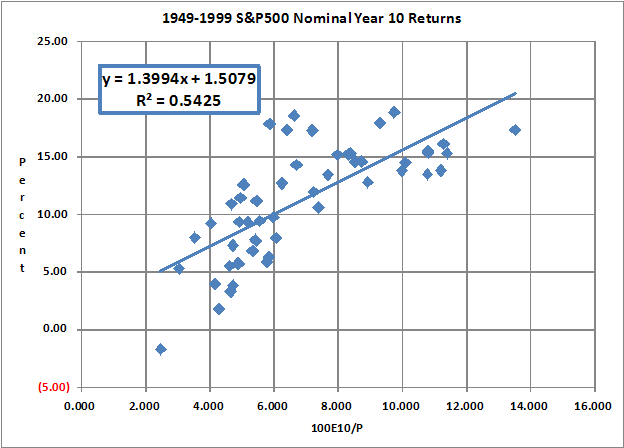
June 5, 2009 update:
Here are the S&P500 nominal Year 10 returns using 1949 through 2009 data. It comes closer to the FKINX returns.
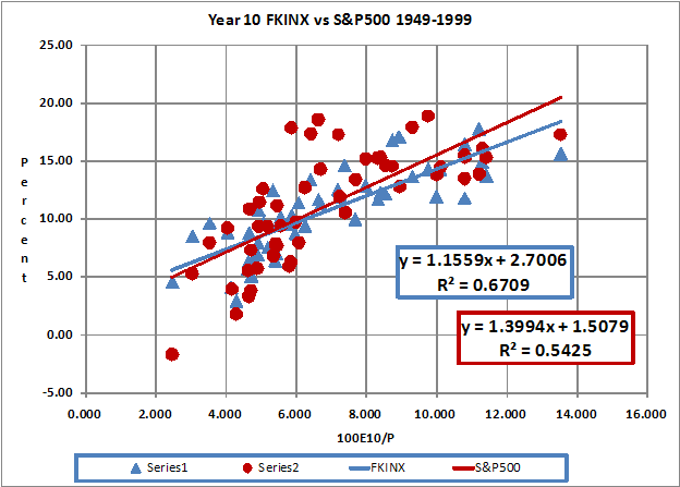
Here is a side by side Year 10 comparison of NOMINAL annualized total returns. The balanced fund does better during times of high valuations.
|